Usual.
Eliminating drive-through lines
with AI voice ordering.
- Scope
- Product Design
- Status
- Concept
- Team
- Solo
- 2020
Drive-through wait times and fulfillment errors increase yearly, decreasing customer satisfaction and creating unnecessary pollution through idling. Usual addresses drive-through overcrowding to implement a lasting solution that eliminates drive-through idling.
For commuters, drive-throughs are just a stop along the way.
Through observation and contextual inquiry, I identified three core user goals: staying comfortable, obtaining desired items, and reliably reaching destinations on time (e.g. arriving at work punctually). While walk-in customers immediately see products and estimate waits based on visible lines and staff activity, drive-through customers face uncertainty. Paired with fast-service expectations, this contributes to mounting frustration.
On the business side, quick-service restaurants operate on thin margins and rely on sales volume — 82% of which comes through the drive-through, on 6–9% profit margins. While 42% are investing in loyalty programs, 35% of customers explicitly state that “tangible improvements to ordering and pickup” would have the greatest impact on their loyalty. The rise of loyalty programs suggests restaurants may be avoiding the core issue rather than addressing it.
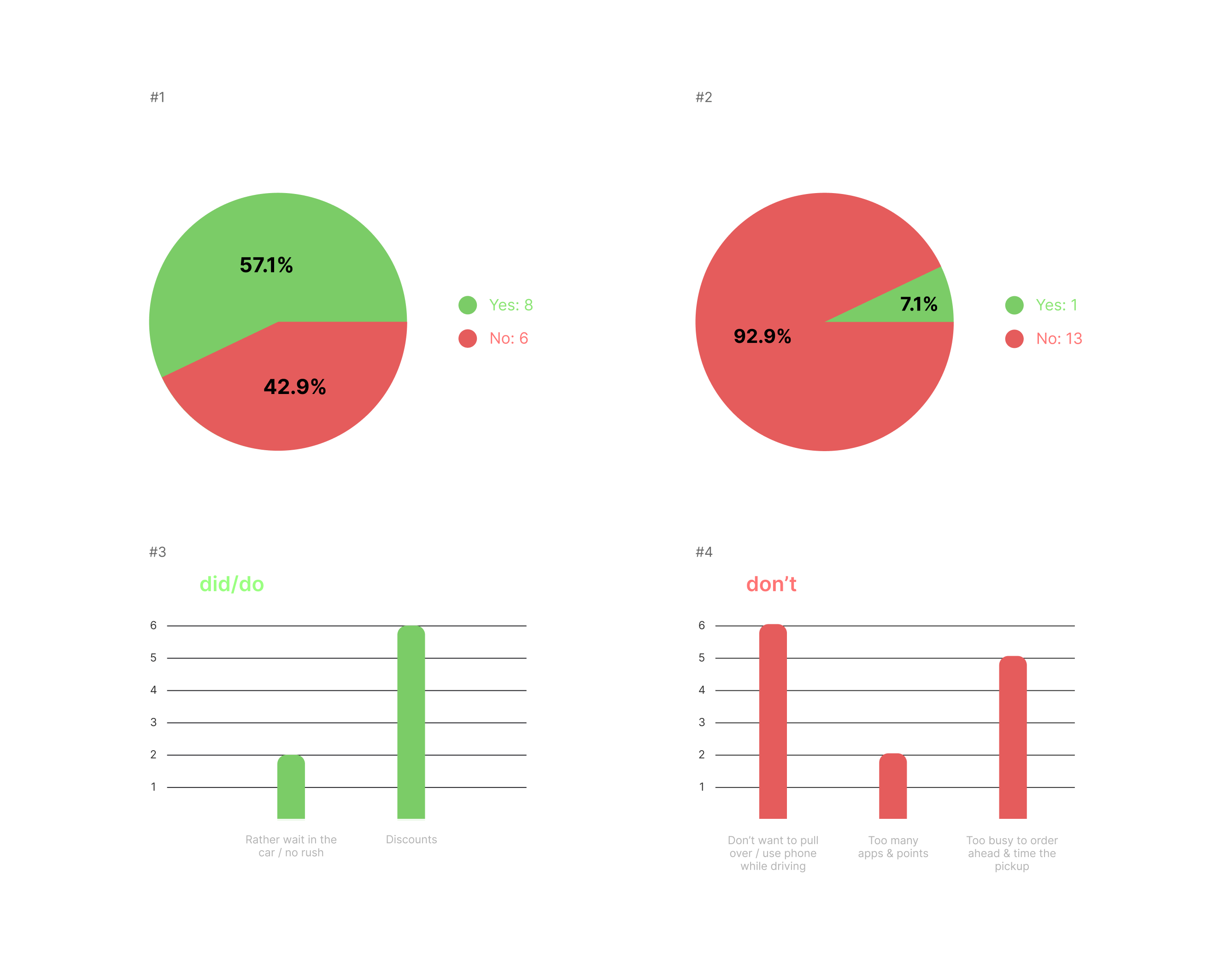
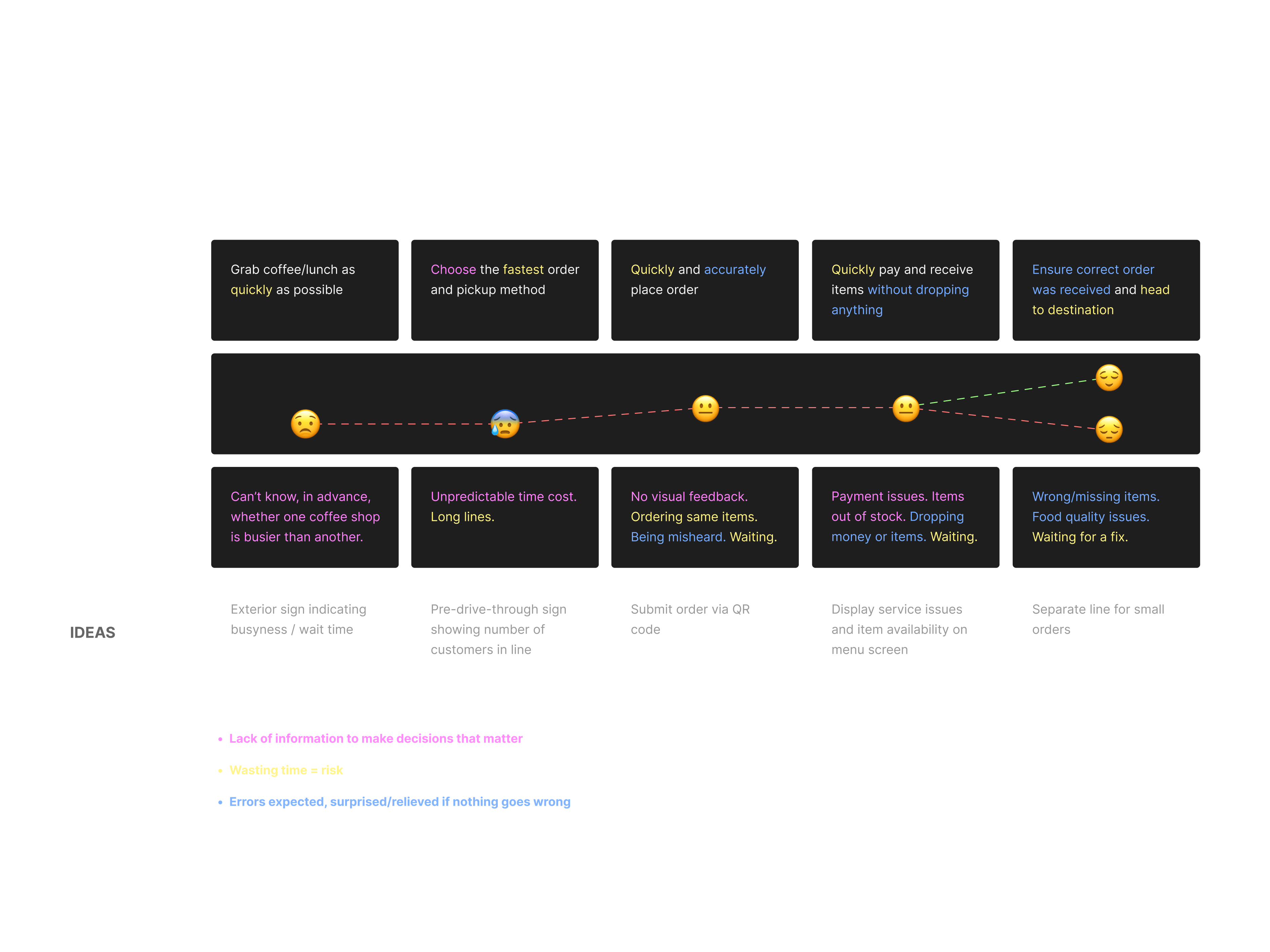
Employees can’t fulfill orders faster than customers can place them.
The bottleneck lies in order placement being quick while fulfillment takes considerably longer than drive-up time. Extended waits are amplified by order complexity, customer volume, and fulfillment errors that require correction.
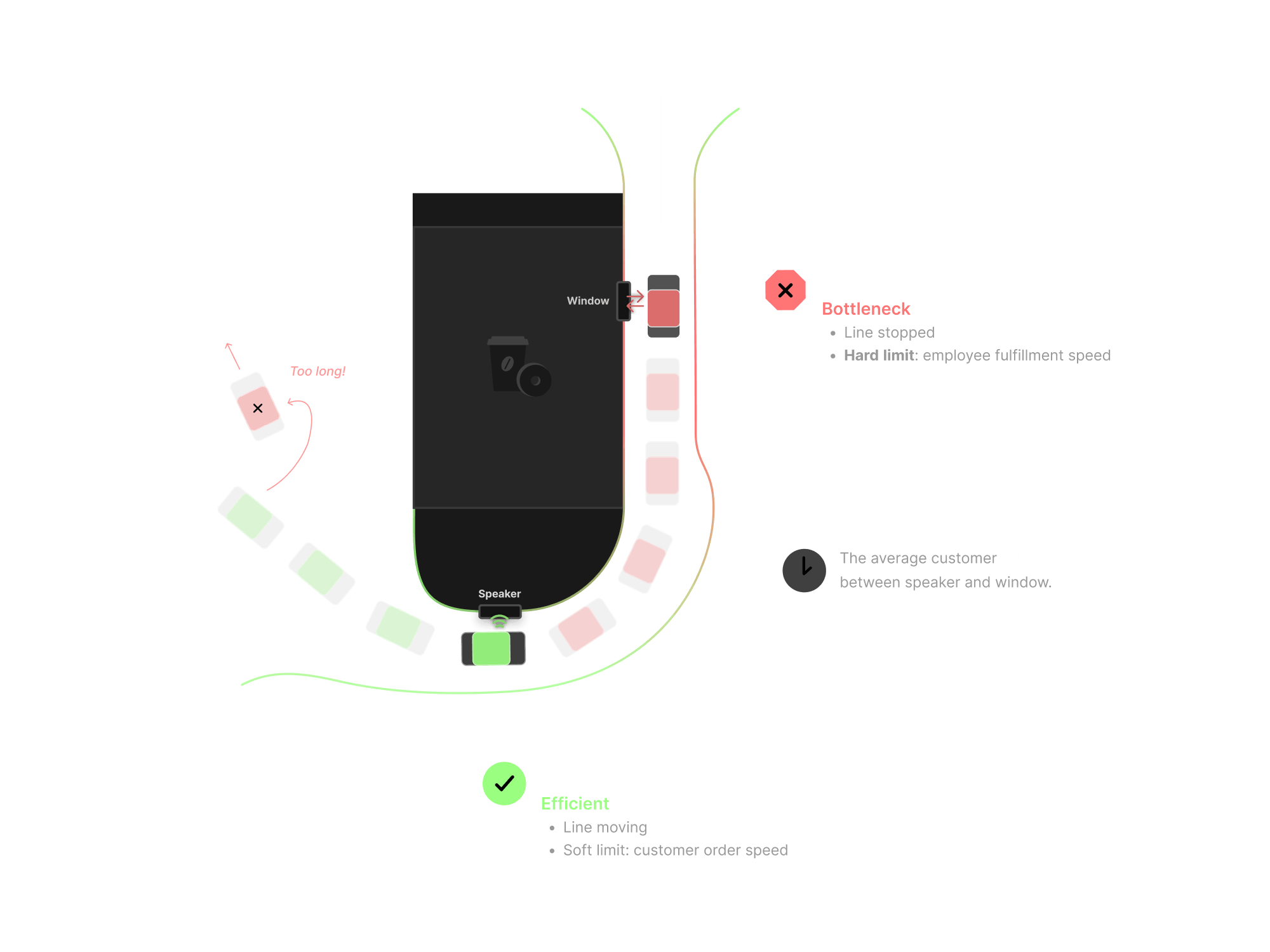
How might we help commuters place orders while driving?
The pickup channel of most mobile-ordering apps continues to drive tiny sales percentages for QSRs because they only consider their side: ordering ahead increases employee fulfillment time, which should reduce wait times. While true, this fails to acknowledge the reality of busy commuters, the people who actually clog up the drive-through.
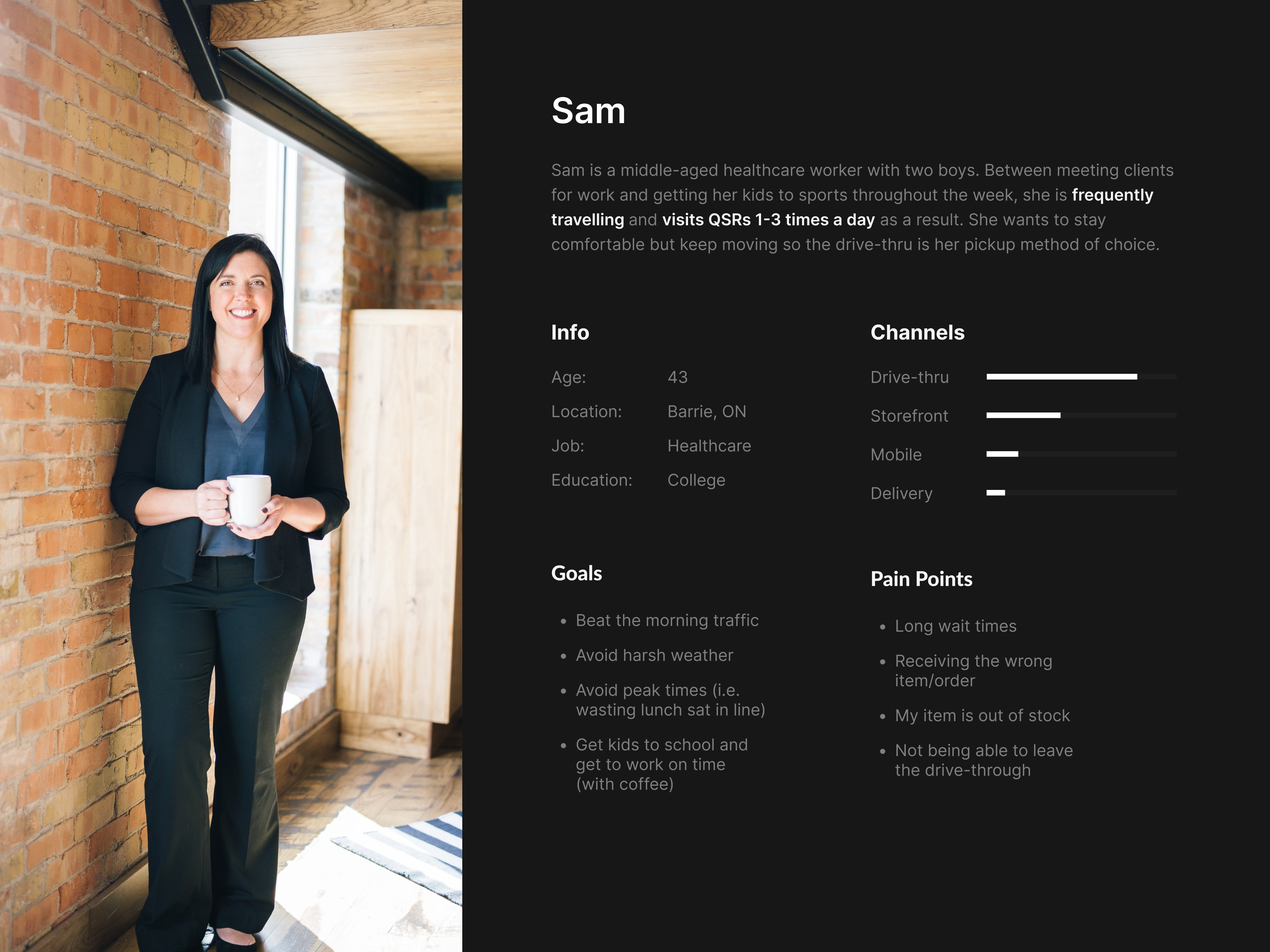
In the mornings, they’re often trying to get the whole family fed, 3 kids ready for school, themselves ready for work, and everyone dropped off at various places at various times. Limited time at lunch and low energy after work drive the same result: commuters do not have the bandwidth to sit down and place orders via touch interaction (the current mode).
Three requirements followed:
- Provide information before ordering — Sam decides whether to order based on expected time cost and item availability.
- Integrate with the overall trip — Sam doesn’t care which location she orders from, only that it aligns fastest with her route.
- Resolve order issues before arrival — an issue requiring a remake means returning to the 4-minute wait.
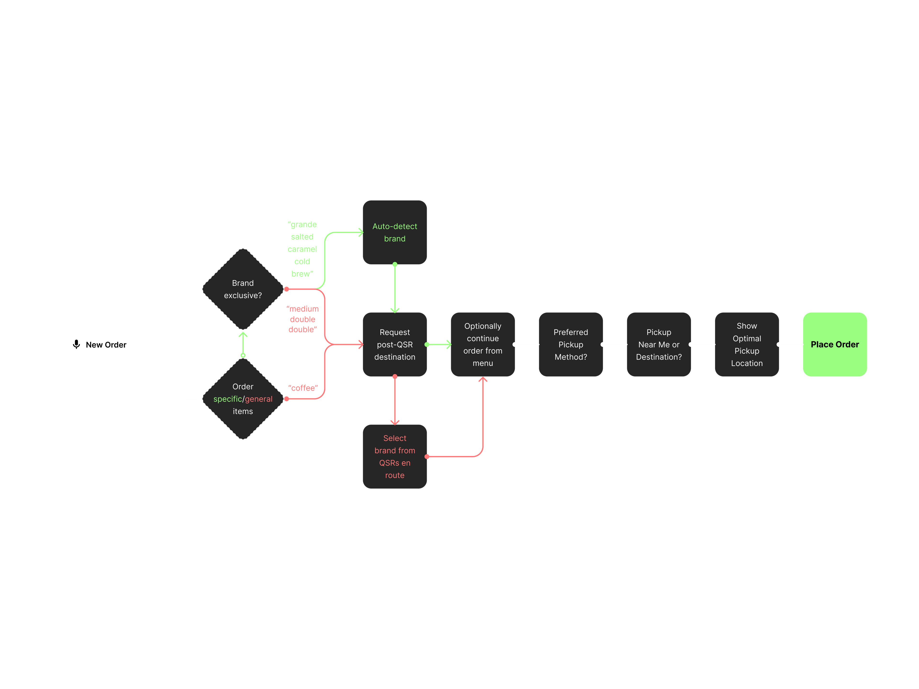
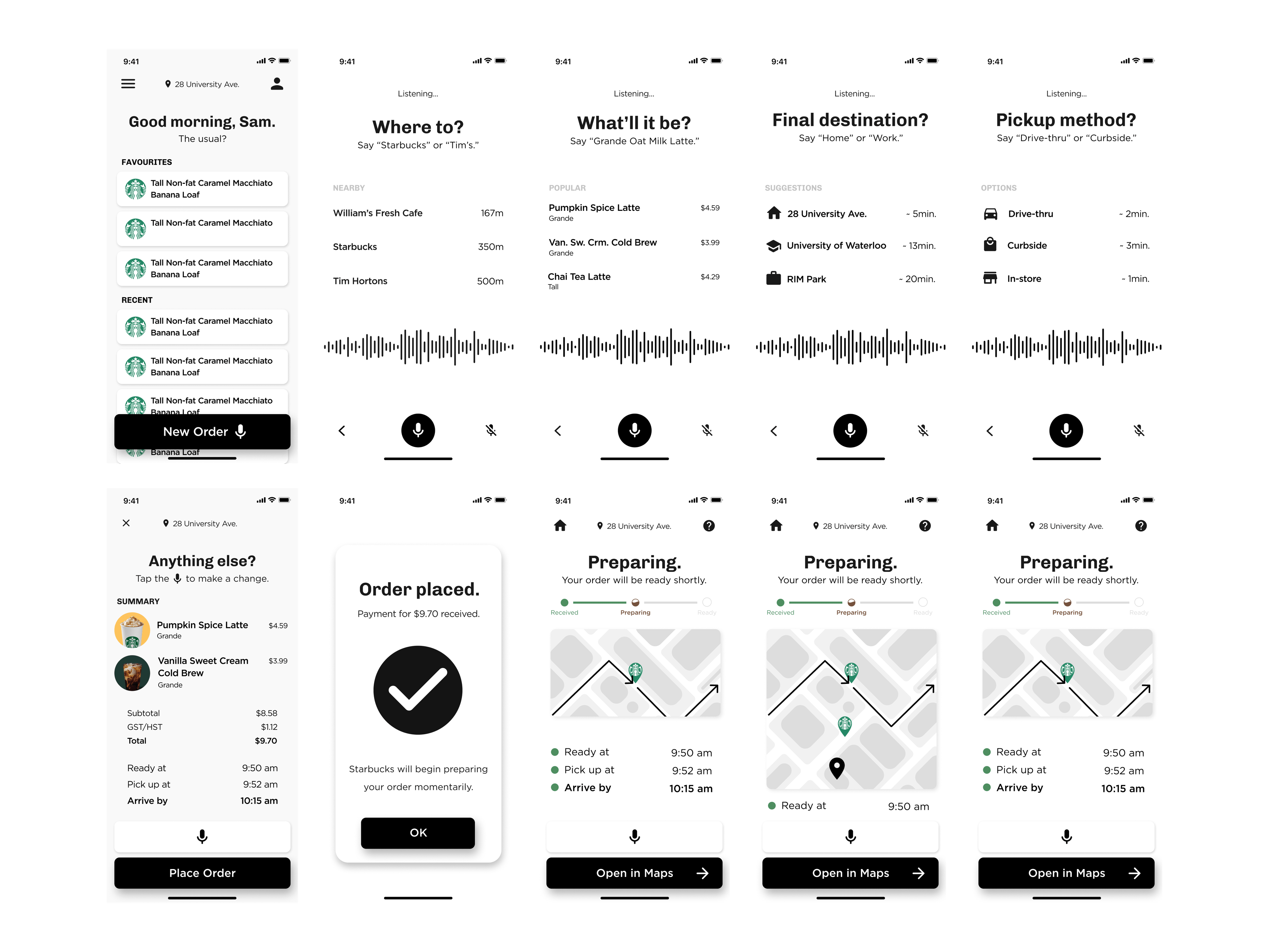
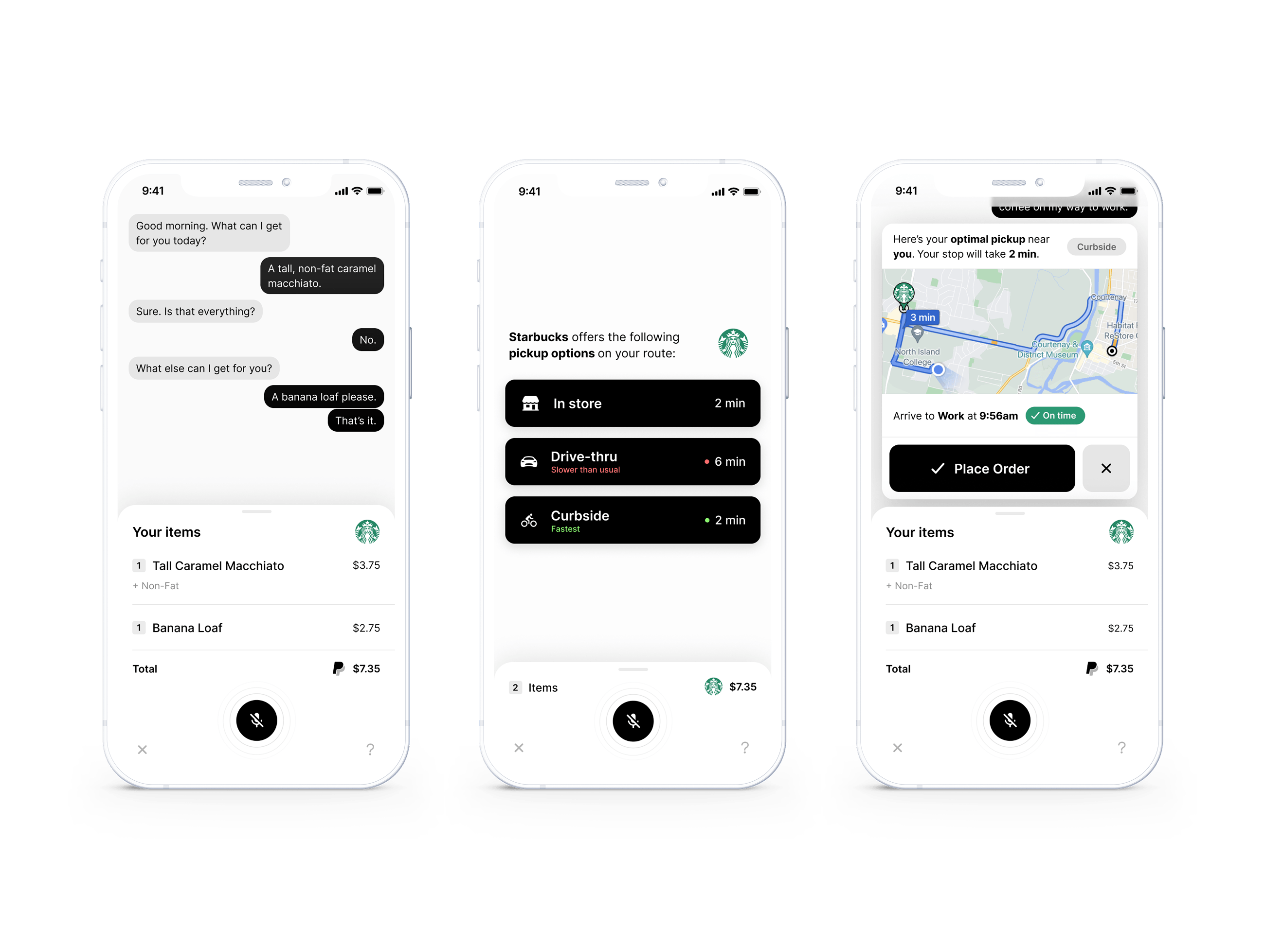
Ordering like you’re at the drive-through speaker.
Usual ensures commuters can actually take advantage of ordering ahead by optimizing for the only input method that aligns with their physical capabilities at the moment of intent. Only once commuters are dressed, fed, and out the door do they have time to breathe, think, and notice they’re hungry. And, assuming they can’t leave work whenever they want, this leaves one window to place orders: while driving. So the solution had to be entirely hands-free.
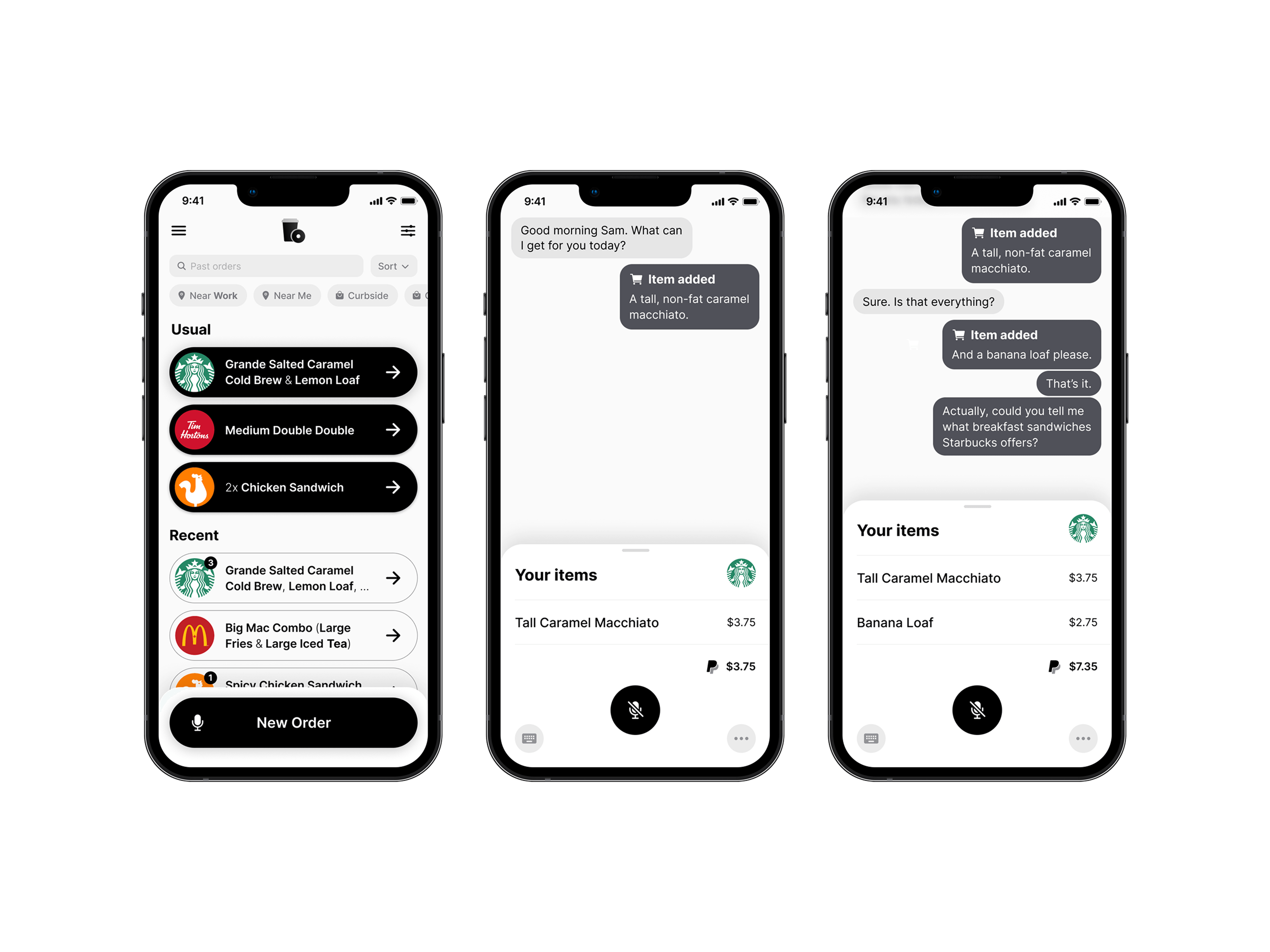
Begin ordering instantly — your restaurant of choice will be auto-detected by identifying brand-exclusive items.
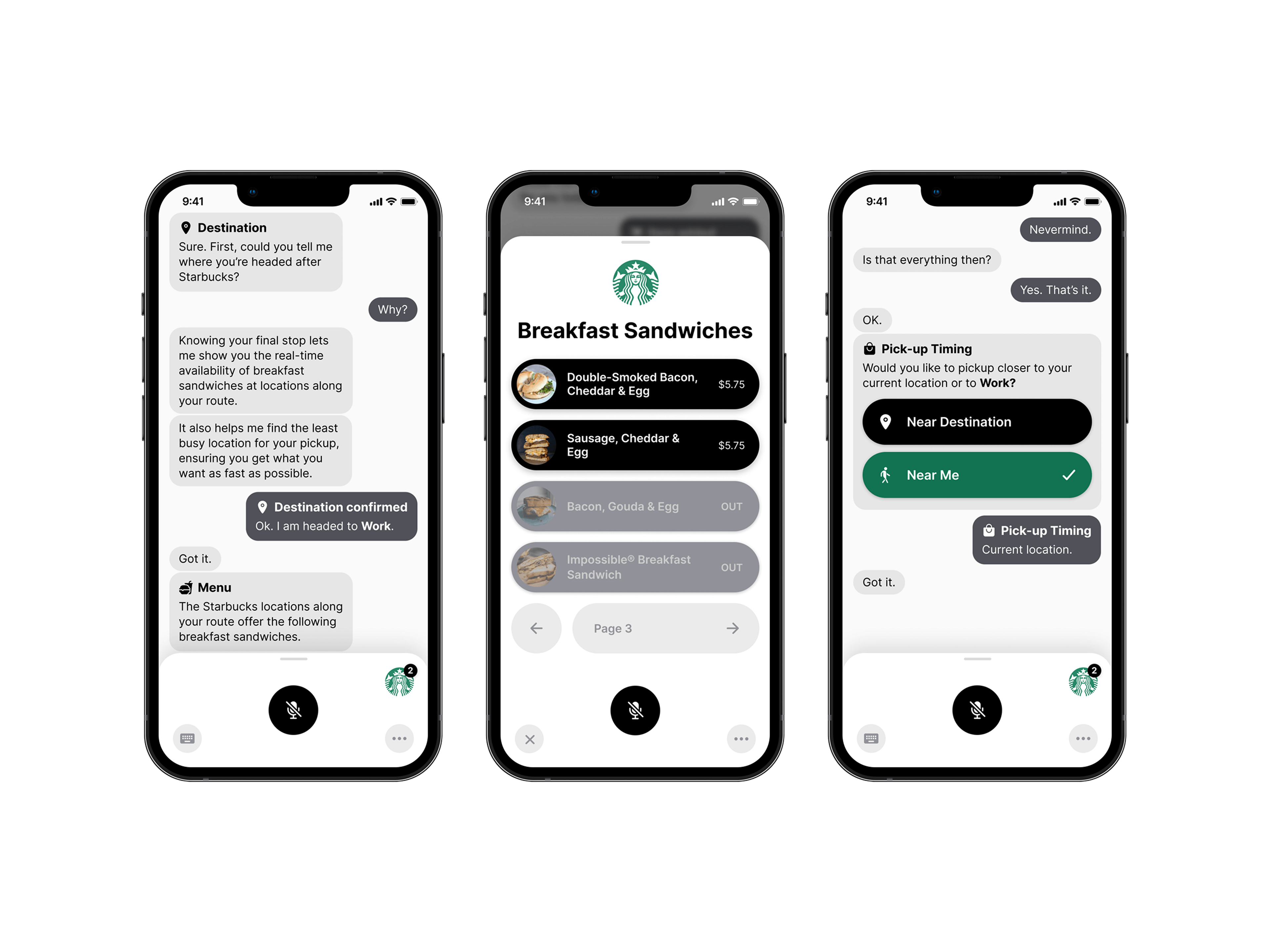
Starbucks isn’t where you’re actually going — providing your true destination merges every location along your route into one, showing only what’s possible.
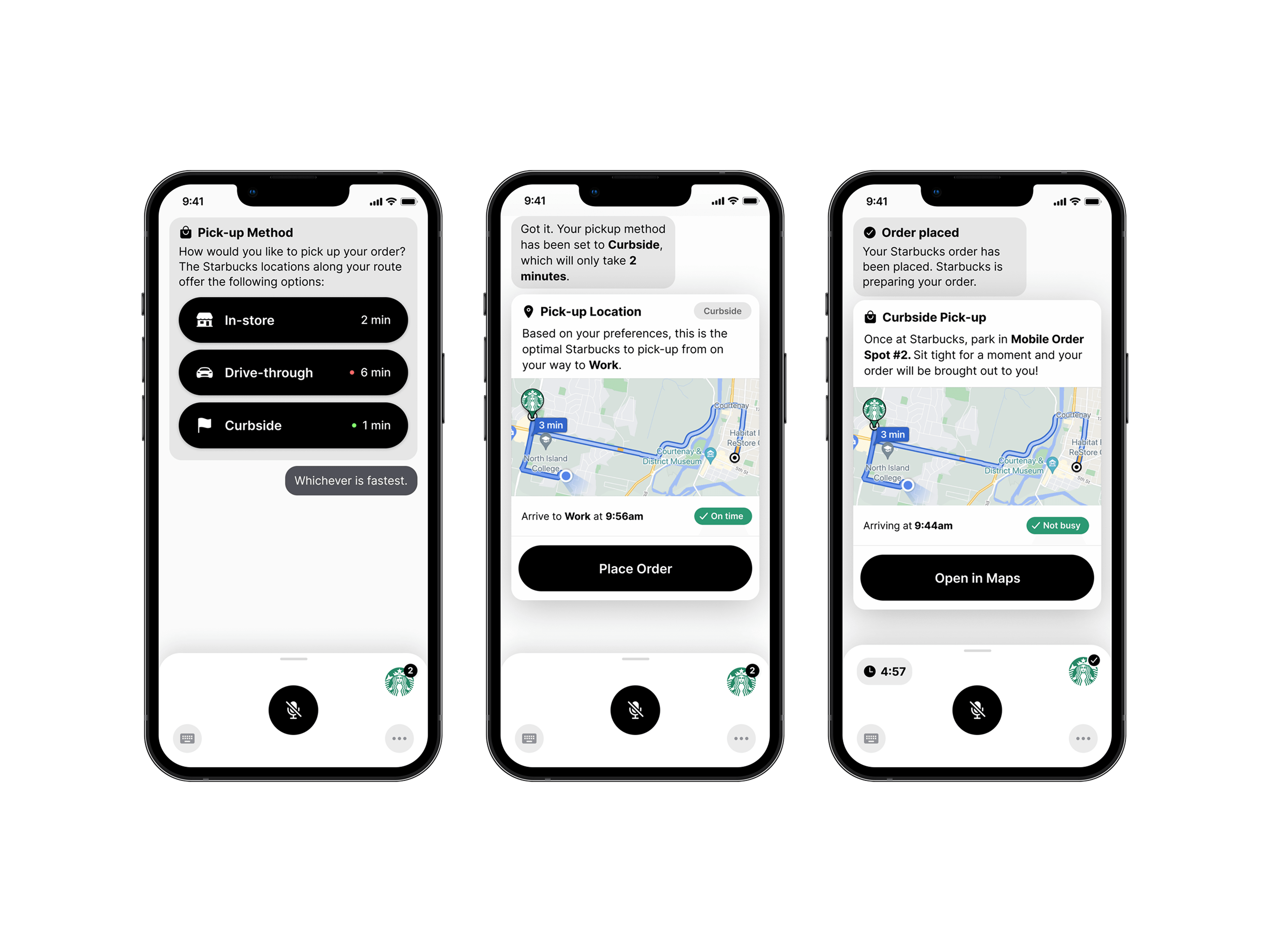
The fastest location finds you — the optimal stop and your true ETA surface from item availability, your pickup preferences, and intelligent route analysis.
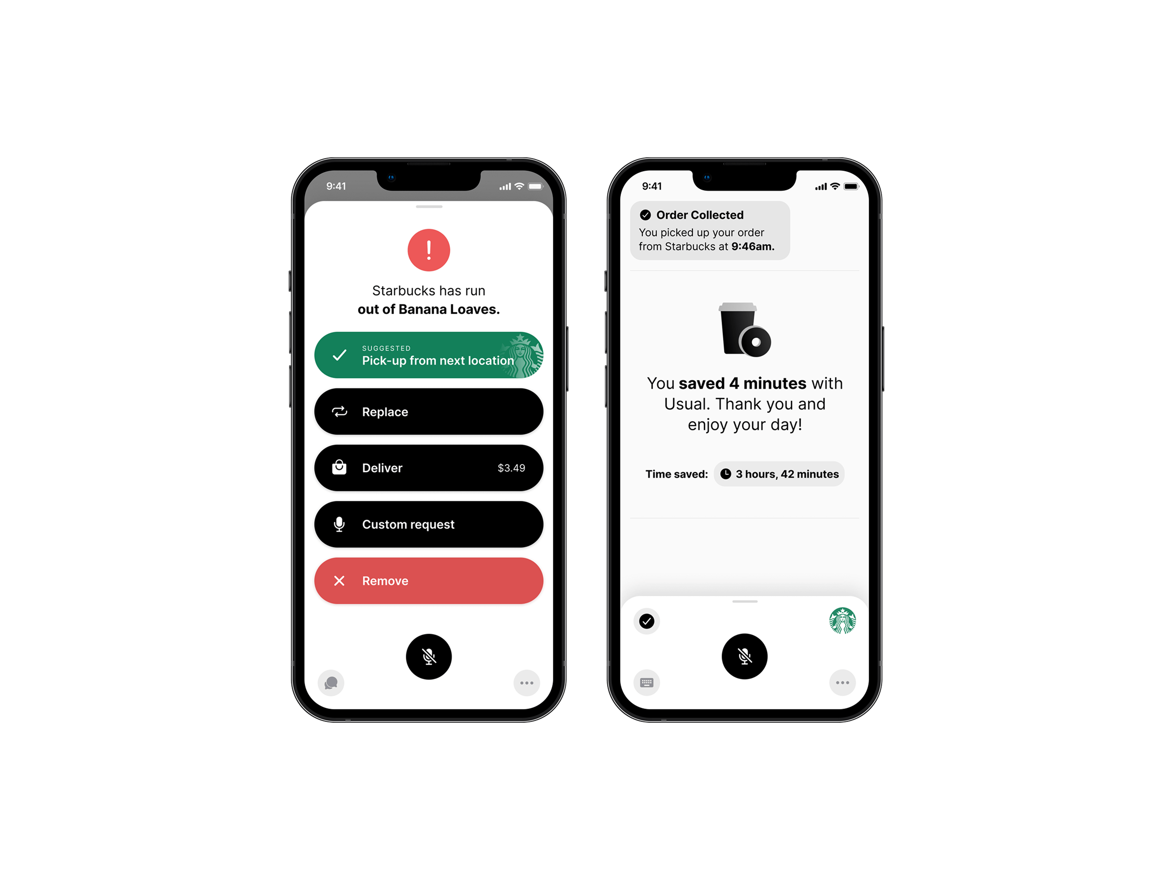
Real problems, real solutions — ordering further ahead gives employees time to restock items, transfer your pick-up location, arrange delivery, or consider special requests.
Visual Design
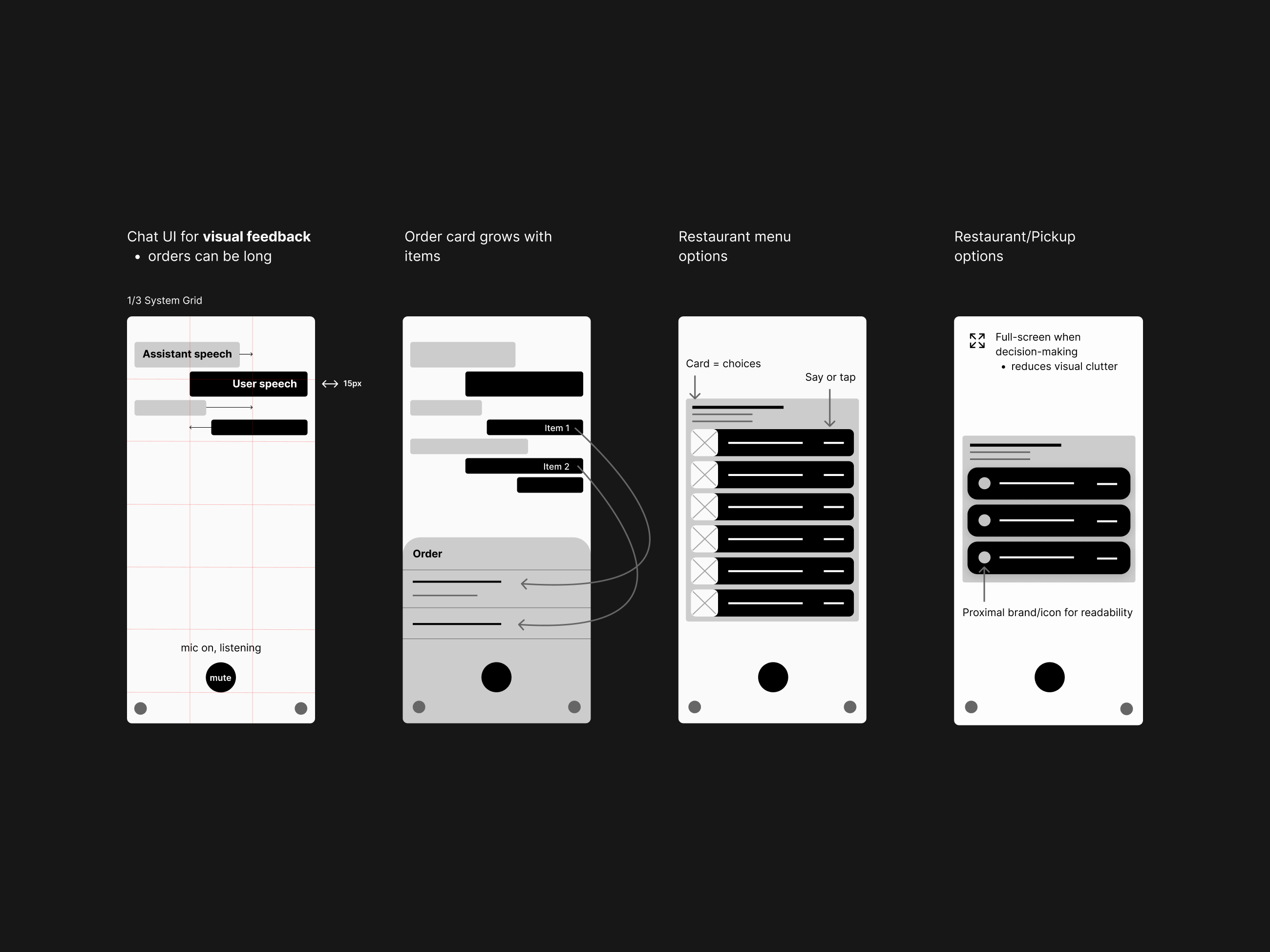
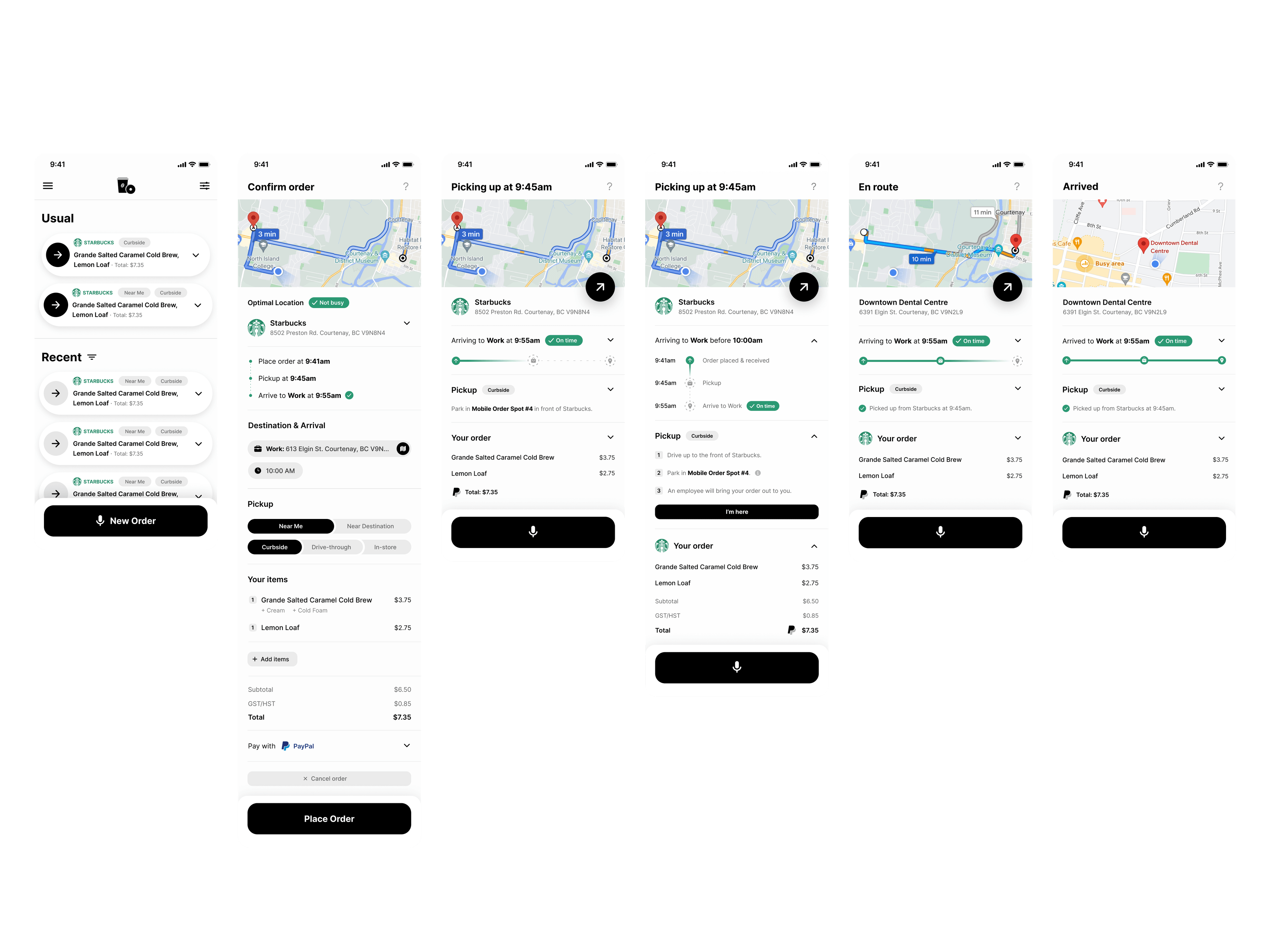
Every visual decision answers the same constraint as the input method: the user is driving. A minimalist, high-contrast black-and-white UI keeps the ordering conversation non-distracting and scannable at arm’s length, mounted to a dashboard. The large buttons do double duty: they enable switching between voice and touch mid-task while keeping every action safely tappable at a glance.
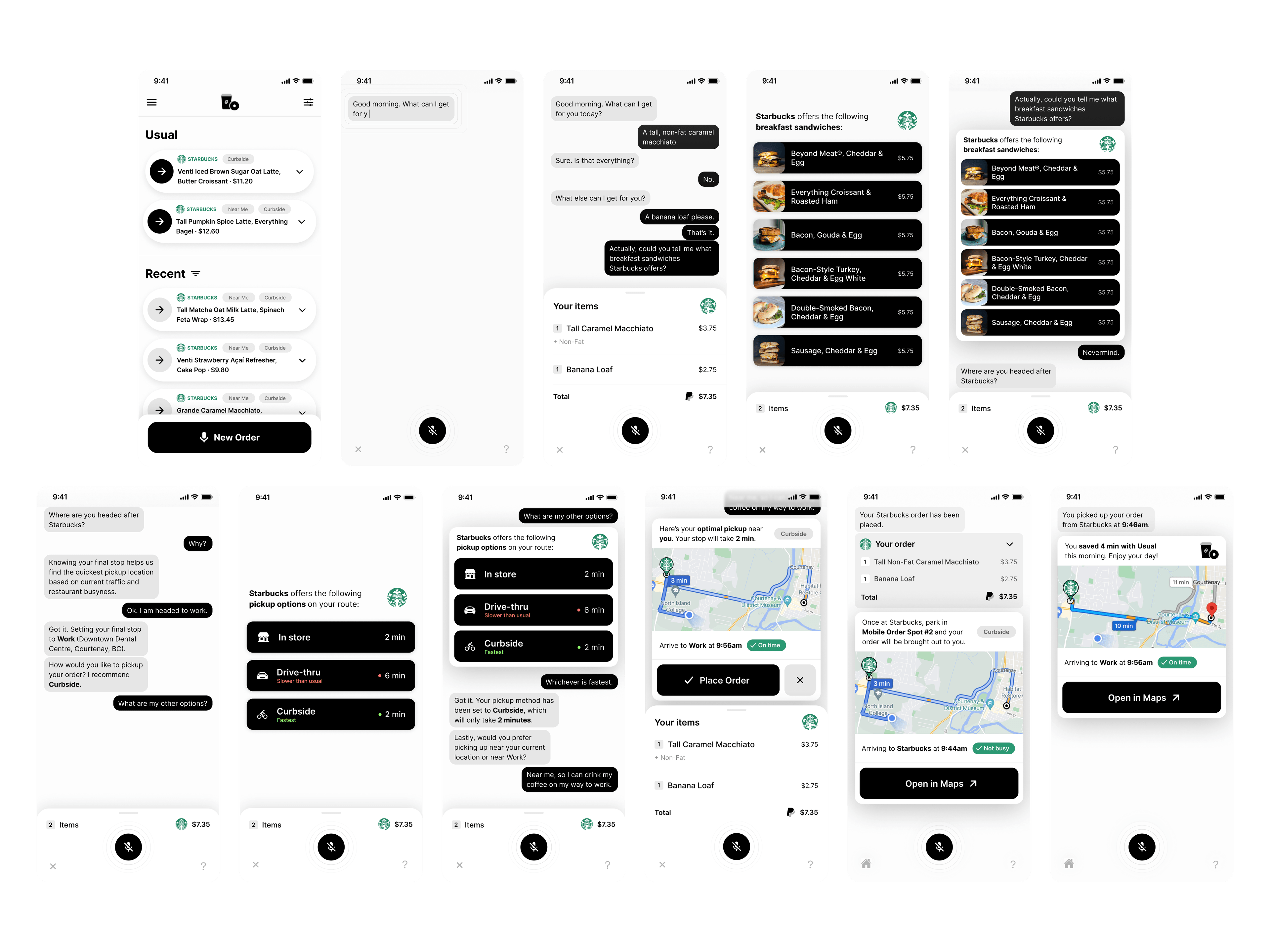
V1 designs
Every voice order becomes a one-swipe usual.
Hypothetical results across user, business, and environment.
User — Adoption wouldn’t be immediate; many customers would continue ordering in person. But the product represents a significant enough improvement that the channel would eventually surpass drive-through usage, ultimately giving the 4 minutes per visit back to the user.
Business — Sales losses stem from slow service and fulfillment errors — unavoidable when employees rush to fulfill 5-minute orders in 30 seconds. Adequate fulfillment time enables seamless, error-free pickup, yielding substantial increases in sales volume, retention, and satisfaction.
Environment — The U.S. Department of Energy estimates personal vehicles generate roughly 30 million tons of CO₂ annually from idling alone. Eliminating even 1 million tons would equal removing 216,000 vehicles from the roads each year.
Less research, more design — and knowing when to break the rules.
Less research, more design. Leaning on my psychology background led to excessive interviews, surveys, and market research that overcomplicated things. The first user interviews provided 80% of the design requirements in 20% of the time — the remaining hours would have served iteration and testing better.
Know when to break the rules. The project required classical UX deliverables, but not all applied. Wireframing was awkward when the design is one main screen with minimal touch interaction. Standardized processes guide helpfully, yet rigid adherence fails for non-standard products.
Efficient interface design. I was initially unfamiliar with auto-layout, column grids, and 8-pixel nudges, and wasted time designing without them. They’ve since substantially sped up my UI workflow.