Calendars.
A comparative usability analysis of the Apple and Google calendar apps on iOS.
- Scope
- Human Factors Research
- Status
- Academic
- Team
- Solo
- 2021
Which mobile calendar is more user-friendly?
As a student frustrated by calendar usability, I formally analyzed Google Calendar and compared it with its primary competitor, Apple’s Calendar, for a UX research course. The goal was to determine which was more user-friendly using a mix of UX research methods to identify usability issues.
Limited to a maximum of 5 participants, I recruited 4 iPhone users of varying technical ability, 1 of whom dropped off after the first experiment. Experiments were conducted remotely over Discord using mobile screen-share while Sheets was used for data collection, analysis, and visualization.
Hypothesis: Despite my biased perception of Apple’s UX dominance and its native OS advantage, I predicted Google’s Calendar would be the more user-friendly application, given its higher overall usership.
Basic scheduling: creating a recurring event.
Scheduling an event is the most common task a calendar supports, so the first experiment tested the primary flow of creating one in each application.
Each participant was given the following task:
“Create a calendar event titled ‘Psychology 101’ and schedule it for September 6th, 2021 between 10:00 and 11:00 AM. Set the event to repeat every Monday, Wednesday, and Friday until December 3rd, 2021. Set a reminder 30 minutes prior to each instance of the event.”
Hypothesis A: Google Calendar will have a higher task success rate than Apple’s Calendar.
Hypothesis B: Google Calendar will require less time on task than Apple’s Calendar.
Apple Calendar
Google Calendar
Multi-user scheduling: inviting guests to a meeting.
Scheduling a virtual meeting should be a primary feature of any modern calendar, so we should expect a highly optimized, user-friendly process.
Each participant was given the following task:
“Create a calendar event titled ‘Meeting’ and schedule it for Monday, March 29, at 3:00pm EST. Invite me to the meeting by email and indicate that you’d like to meet remotely via Zoom.”
Hypothesis A: Apple Calendar will have more unique usability issues than Google Calendar.
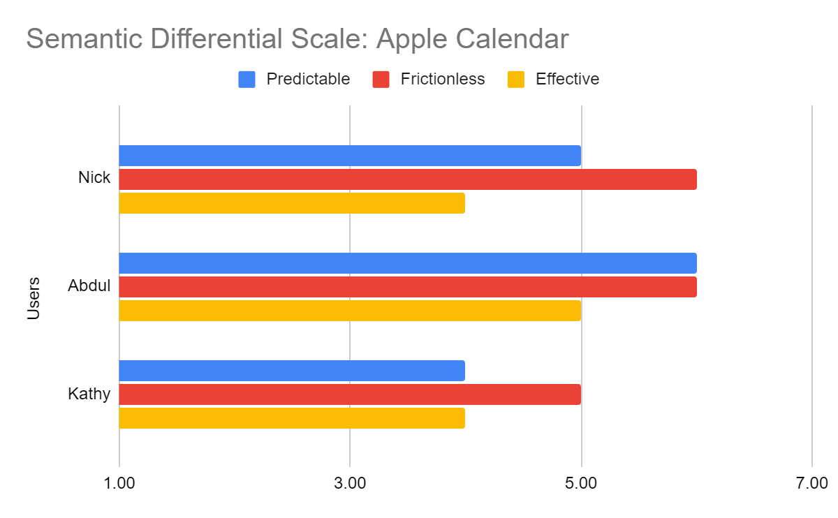
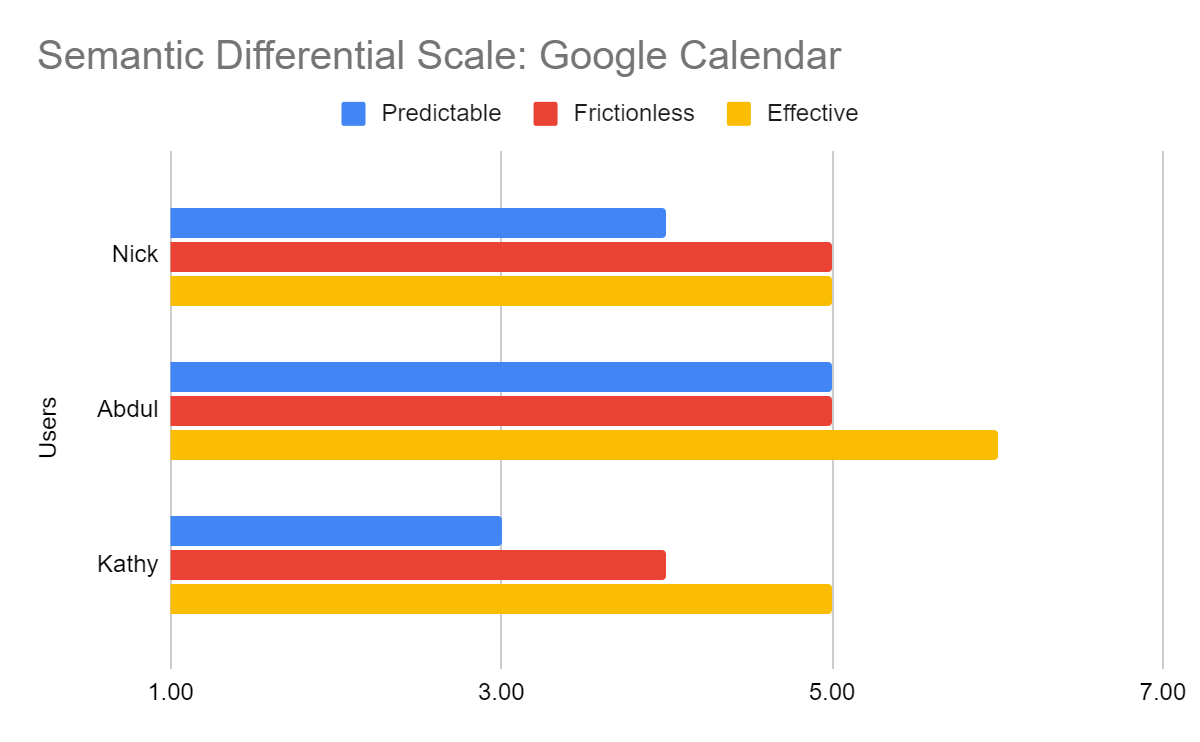
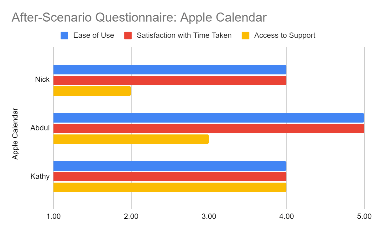
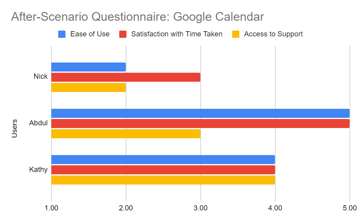
Hypothesis B: Apple Calendar’s self-reported user satisfaction will be lower than Google Calendar’s.
Calendar views: creating and navigating sub-calendars.
Sub-calendars categorize particular dates and events, like birthdays and holidays, and navigating between them is another core flow of any calendar app.
Each participant was given the following task:
“Create two calendars and title one ‘Work’ and the other ‘Play.’ Then, enter a monthly view of only these two calendars for the month of December 2021.”
Hypothesis A: Apple Calendar’s ratio of positive to negative comments will be higher than Google Calendar’s.
Statistical ties, shared usability failures.
Experiment 1: Basic scheduling
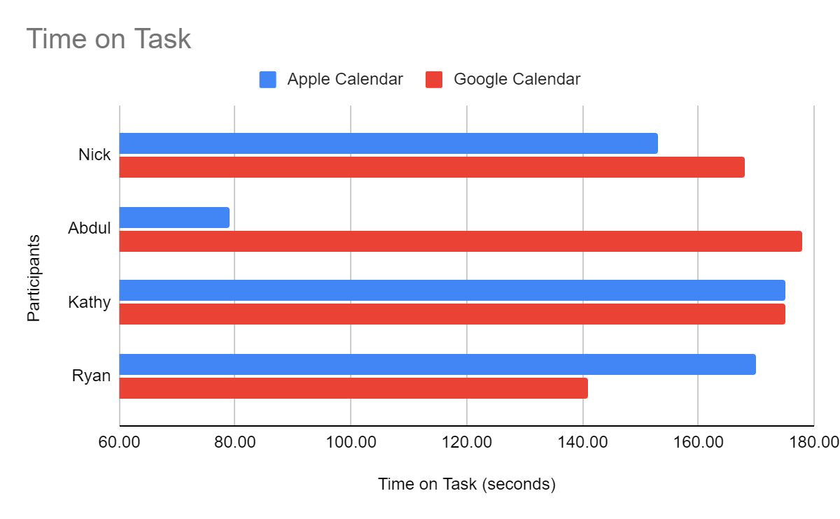
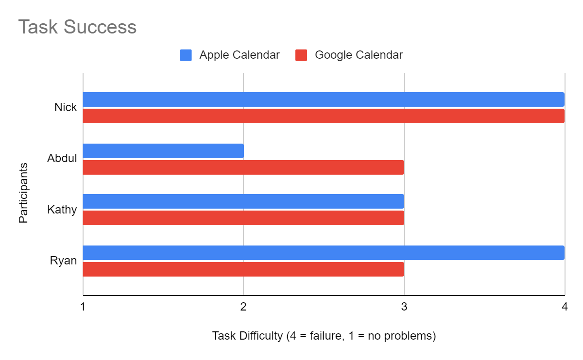
Neither hypothesis held: task success showed no significant difference (α = 0.65), nor did time on task (α = 0.41).
Both apps proved equally problematic. Users struggled to set multi-day recurring events, particularly not recognizing they needed to select “weekly” before choosing specific days. My recommendation: display a row of the seven days of the week as buttons that can each be selected or deselected, alongside the existing options.
Experiment 2: Multi-user scheduling
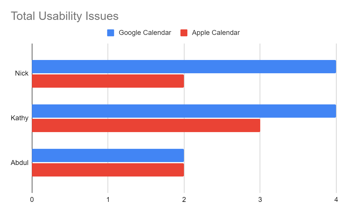
Neither hypothesis held: no significant difference in unique issues (α = 0.25), Semantic Differential satisfaction (α = 0.92), or After-Scenario Questionnaire satisfaction (α = 0.90).
Users preferred Google’s visual design yet reported lower overall satisfaction; Apple offered less functionality but users appreciated its simplicity. Both apps confused guest search (users searched by name when emails were required) and timezone selection (no simple EST/PST abbreviations), and Apple’s missing invite function had no explanatory messaging.
Experiment 3: Calendar views
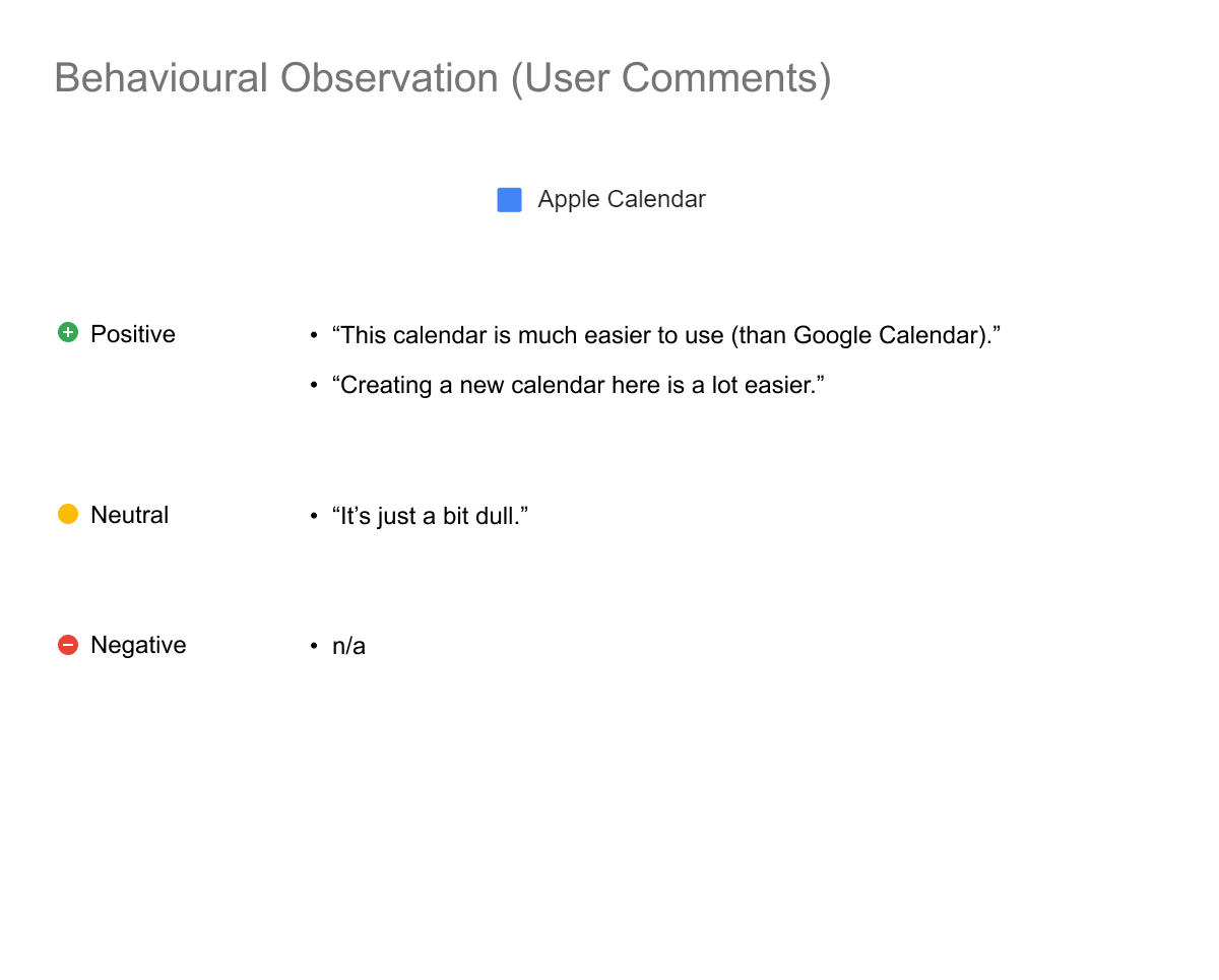
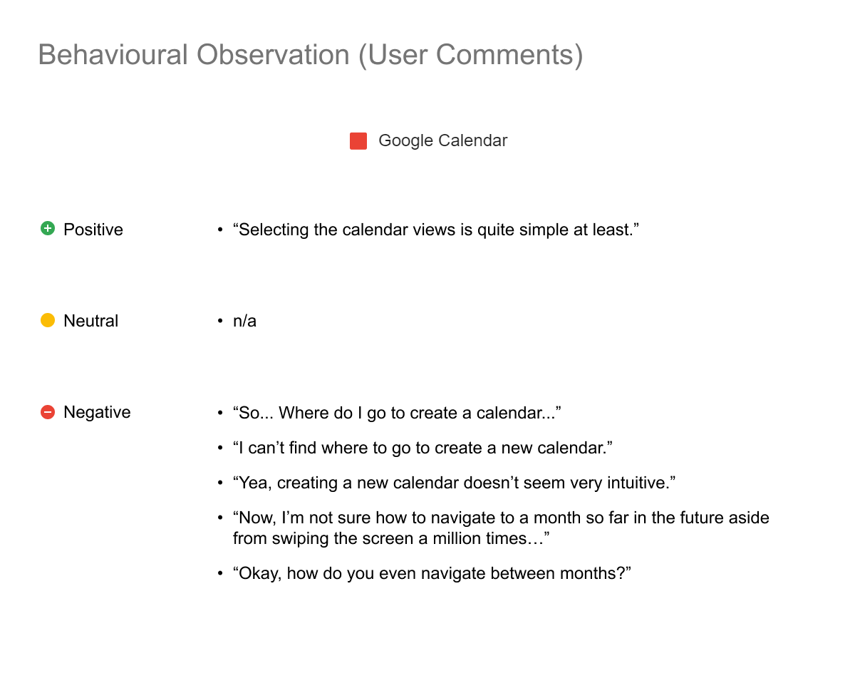
The hypothesis held: Apple’s positive-to-negative comment ratio (2:0) far exceeded Google’s (1:5).
Google Calendar lacks iOS functionality for creating new calendars, and its time navigation and view-switching (day/week/month/year) proved unintuitive.
Apple wins on the quality of what exists.
Google Calendar scored a combined usability score of 43.7% while Apple Calendar scored 39.4%. While this supported my initial hypothesis favoring Google, neither scored highly and the measurable difference was insignificant.
Based on behavioural observations, I argued Apple’s Calendar was slightly superior: its usability issues mostly resulted from expected features that were “missing”, and that restraint likely has downstream UX-simplifying effects. Whereas, Google Calendar’s usability issues surfaced within its shipped features.
On bias: I may have overestimated mobile calendar capabilities given my predominantly desktop-based usage, but I maintain reasonable expectations for what a modern mobile calendar should do.